
An infographic is a valuable tool where readers can take in information and understand the material through a visually appealing graphic. In the topic of food, an infographic can showcase dishes, ingredients, and nutritional information in an attractive way.
My earliest memory of an infographic is from MyPlate – going in to my pediatrician’s office and seeing posters of what a balanced meal entails. As a 5-year-old, this infographic was easy for me to grasp. They’ve done such a great job, that I even remember seeing this infographic during my time in secondary school.
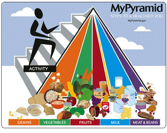
It looks like the United States Department of Agriculture revisted their recommendations, as they visually display each food group. Now, the USDA replaced the pyramid with a plate. From a PR perspective, the audience nay now have a better understanding of what food group needs to be emphasized. The MyPyramid had an emphasis on grains, while MyPlate focuses on fruits and vegetables taking up half the plate.
On MyPlate’s site, they provide infographics from fact cards to meals. If we take a look at their MyPlate Guide to School Breakfast and MyPlate Guide to School Lunch, they offer a great visual of what a balanced meal entails.
MyPlate presents the five areas that children need to have on their plate: fruits, vegetables, protein foods, grains, and dairy. In each description, they provide a short explanation of what vitamins are provided and why they are important. Though the infographic doesn’t contain any statistics, it still provides readers a clear visual of what they should be putting on their plates.
With MyPlate’s newer straightforward and user-friendly approach to healthy eating habits, groups have a better understanding of applying these food groups to their daily meals. Try out the MyPlate strategy on your next meal!
Featured Image by Pexels

Leave a comment